AMES, Iowa -- Iowa State University graphic design faculty and graduate students were part of a two-year collaboration to create universal symbols that help non-English speakers find their way through health care facilities. The 22 navigational symbols -- along with 28 designed previously by professionals -- were released this fall for use in health care facilities around the country.
The project is featured in the current issue of SEGD Design, the journal of environmental graphic design, (available online at http://issuu.com/segddesign/docs/segd30_digital).
Lisa Fontaine, an ISU associate professor of graphic design, was one of four professors selected to participate in the national effort that involved Hablamos Juntos, the Society of Environmental Graphic Design (SEGD) and four design schools. The project was funded under a grant from Robert Wood Johnson Foundation to Hablamos Juntos, a University of California, San Francisco program that develops practical solutions for language barriers to health care.
In addition to Iowa State, the design school consortium included California Polytechnic State University, San Luis Obispo; Kent State University, Ohio; and University of Cincinnati, Ohio. Each school has symbol design within its graphic design curricula as well as experience in user-centered design and design research.
Collaborative effort
Students in the four design schools worked to design 155 symbols that would be understood by linguistically diverse subjects.
"This was the first time this type of collaboration has happened nationally, with multiple design programs working together on one design project," said Fontaine. The consortium met by phone each week to discuss and compare curricular approaches.
Graduate students in Fontaine's symbol design studio course worked on the project. The students started their design process by studying symbol history and taxonomy, as well as existing pictographic symbols and standards.
"Symbol systems have tremendous potential for cross-cultural communication, but their extreme simplicity also risks the possibility of misunderstanding," Fontaine explained.
Each school worked on a different subset of 22 symbol topics. Iowa State students worked on symbols for imaging, alternative medicine, health education, kidney center and mental health.
User testing
After the symbols were created, they were tested with users. Fontaine directed the research phase of the project. Speakers from four different language groups (native English, Spanish, Asian and Indo-European) assessed the student-designed symbols.
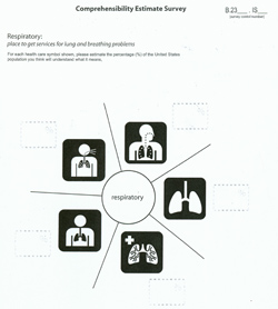
The collaborative adapted a standard comprehension test instrument for responders to use to identify the symbol that best represented a specific meaning/health care location. Five different student-designed symbols representing the same location (i.e. kidney center), along with that location's name, were presented on one page. Responders were asked to estimate what percentage of people who speak their language in the U.S. would understand each of the symbols shown.
A total of 231 respondents - with at least 50 from each language group -- completed the survey. After the data collection, Fontaine compiled the findings and prepared the preliminary analysis.
"Our main goal was to select the symbol with the best results overall," Fontaine explained. "Fortunately, we didn't see much difference from one language group to another -- what was clear to one group, was clear to another."
Differences in language and culture can affect the comprehension of symbols. Fontaine said the lack of cultural difference in the selection of these medical symbols could be because they're technical topics.
Challenges
One of the greatest challenges for the designers was determining whether the symbol should depict the area of the body affected or the process. According to Fontaine, their findings show that, in most instances, people wanted to see the placement on the body.
"They have to see it and understand it immediately. We found the more metaphoric the symbol was, the worse the comprehension," she said.
Successes
 Cath lab symbol
The symbol selected to represent the cath lab was designed by an Emmanuel Saka, an Iowa State graphic design graduate student from Ghana.
Fontaine and her colleagues on the project have presented the research at Sign '09, the international sign conference held in Vienna last December; the SEGD Annual Conference in Washington, D.C. in June; and the International Humanities Conference in Los Angeles in June. They also will present the research at the Usability Professionals Association Conference in Atlanta next June.
"The project also gave the academic programs an opportunity to work together in a highly focused effort to develop a national capacity for ongoing graphic symbol design and evaluations," Fontaine said.
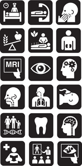 Symbols by
students in the collaborative.
Symbols by
students in the collaborative.